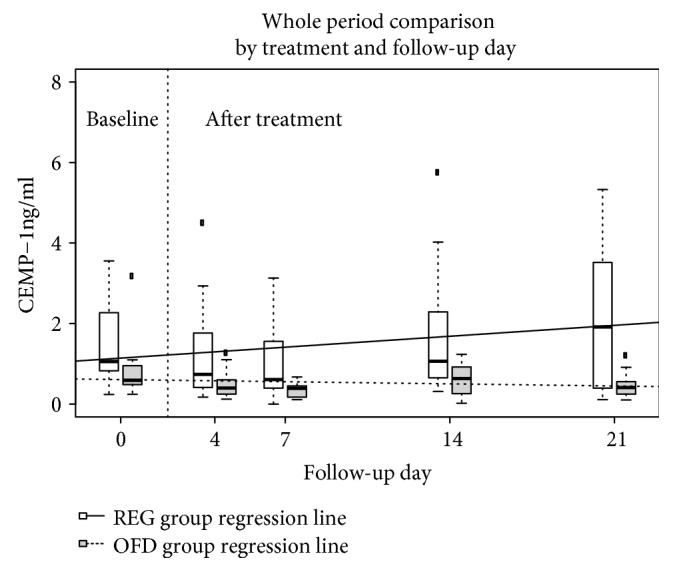
Figure 5.

Plot representing distribution of CEMP-1 in ng/ml by treatment and week (baseline is day 0, while days 4 to 21 are after treatment) using box plots. The REG group is white, OFD is grey, the thick black line is the median, the box contains the 1st to the 3rd quartile, and the whiskers are the lowest and highest values within 1.5 times the interquartile range from the box, other values are represented as outliers. The regression lines from the linear mixed model are also plotted (REG, line; OFD, dashed line).
