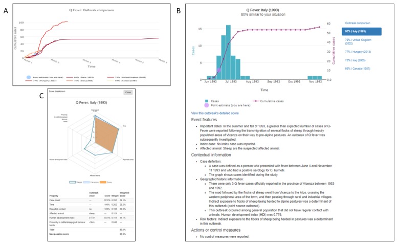
Figure 4.

AIDO case study: Q-fever outbreak in in Bilbao, Spain in 2014. Panel A shows the outbreak comparison graph for the five most similar outbreaks, and a point estimate reflecting the user's situation in this context. Here, line colors with higher saturation correspond to higher similarity. In panel B, the graph shows an outbreak time series for a Q Fever outbreak in Italy in 1993. Panel C shows a breakdown of the similarity score between the user's unfolding outbreak and the historical outbreak. All graphs presented in AIDO are interactive and available for download in multiple formats.
