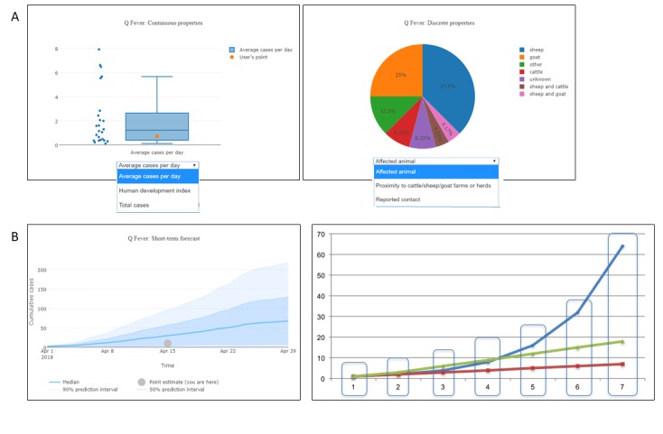
Figure 5.

Additional analytics-anomaly detection and short-term forecast. Panel A illustrates two types of graphs used in the anomaly detection tab. Continuous variables (e.g., average cases per day, population at risk, or total cases) are shown as box plots. Discrete or categorical variables (e.g., season or affected animal) are shown as pie charts. The example presented shows that the case study outbreak is similar to other outbreaks included in our library. Panel B shows short term forecasting using the method of analogs. The data shown here can be used to estimate cumulative case count. This figure also demonstrates how data points are aligned for the short-term forecast.
