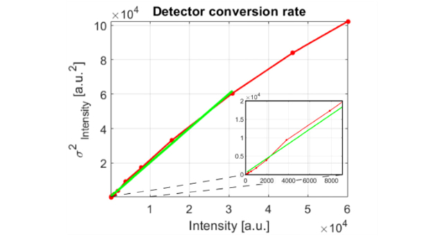
Fig. 6.
Variance vs. mean intensity signal as measured for the PCO.EDGE 5.5 camera. Raw data points are marked with red dots; the red line show raw signal linearly interpolated between sampling points and the green line depicts a first degree polynomial fitted to the linear part of the data set. Inset in the right bottom of the plot depicts magnified region of correlogram, for which average signal was below 8000 counts.

