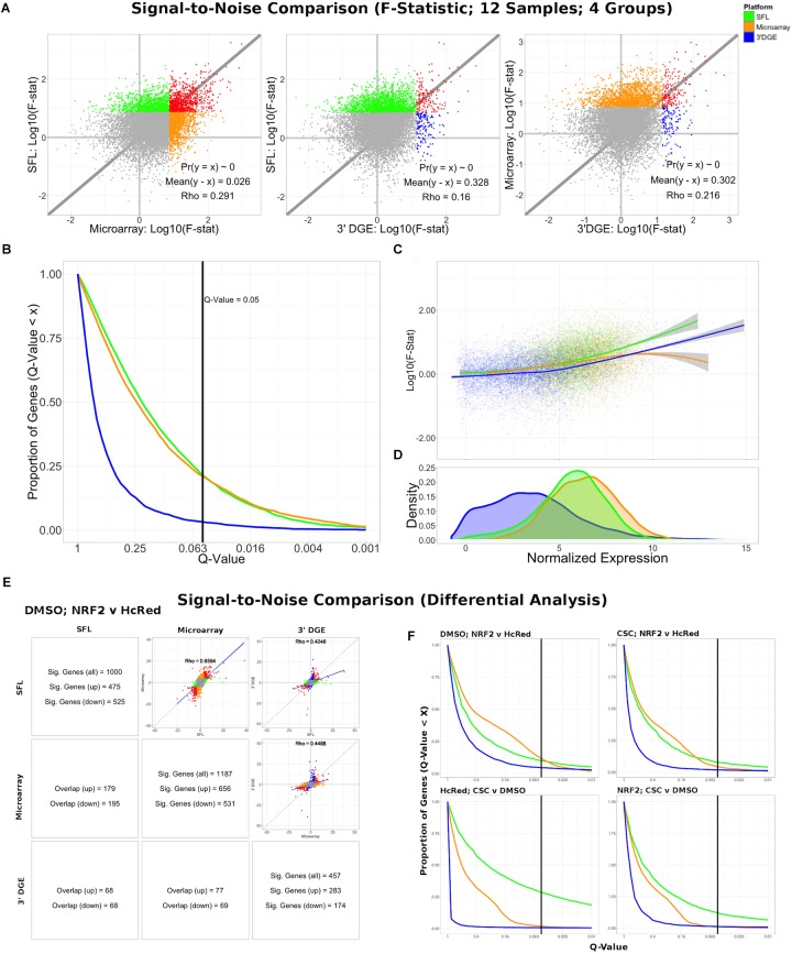
FIGURE 3.
Signal-to-noise comparison between SFL, microarray, and 3′DGE. (A) Scatterplots comparing the log10(F-Statistics) from ANOVA models comparing four n = 3 groups (HcRed:DMSO, HcRed:CSC, NRF2:DMSO, and NRF2:CSC). The gray line shows y = x. The platform with the higher mean log10(F-Statistic) is plotted on the y-axis. Also, included are the p-value and difference in mean between each bi-platform comparison from paired t-testing, as well as the squared correlation coefficient. P-values ∼ 0 are less than 0.01. Color of indicate genes discovered by individual platforms (green, orange, or blue), neither platform (gray), and both platforms (red). (B) Plot of the Discovery Rate versus FDR Q-Value from threshold for each platform from four group ANOVA models. The x-axis is plotted on a –log10 scale. The vertical line is indicative of a Q-value threshold of 0.05. (C) Loess fit of the log10(F-Statistic) versus median normalized expression from four group ANOVA models. (D) Distribution of mean normalized expression across all three platforms. (E) Comparison of gene discovery (FDR Q-Value < 0.05) by differential analysis with limma, comparing normalized gene expression between DMSO:NRF2 and DMSO:HcRed, including the raw discovery rates, discovered gene overlap, and linear fits, comparing test statistics from each platform. Genes that are discovered by more than 1 platform are shown in red in the scatterplots. Additional comparisons are shown in Supplementary Figure S5. (F) Plot of the Discovery Rate versus FDR Q-Value from threshold for each platform from two group differential analyses. The x-axis is plotted on a –Log10 scale. The vertical line is indicative of a Q-value threshold of 0.05.

