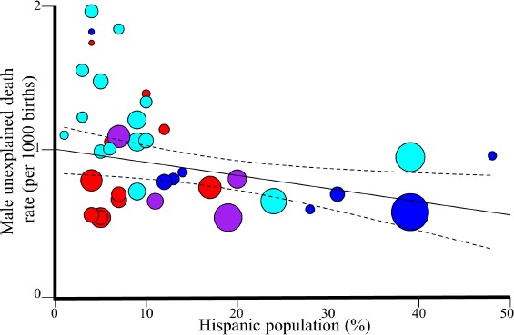
Figure 2.

Regression analysis of Hispanic in the US and unexplained male mortality rates in 2015. The 95% confidence intervals of the best fit line are denoted in dashed lines. Colors correspond to four US regions: Northeast (violet), Midwest (red), South (cyan), and West (blue).
