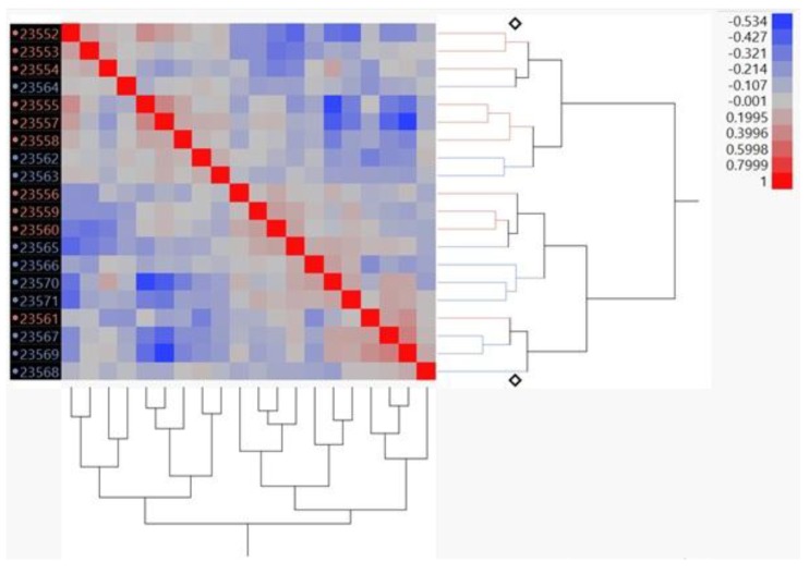
Figure A1.
Correlation heat map using transcripts per kilobase million normalization. The heat map represents the graphical display resulting from unsupervised clustering of the correlations between samples. The x- and y-axis are the same and the red diagonal line represents a correlation of 1. The pink labeled IDs are associated with the soybean diet while the blue labeled IDs are from the corn oil diet.

