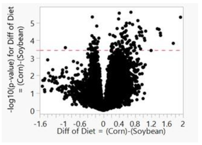
Figure A2.
Volcano plot for upper transcripts per kilobase million normalization. The x-axis displays the difference in log scale, and the y-axis plots the –log10(p-value) for each transcript, represented by a point. Significance threshold is graphed with a dotted red line (3.430). Points to the right of 0 and above the significance threshold are significantly increased transcripts, and transcripts that are significantly decreased are to the left of 0 and above the threshold line.

