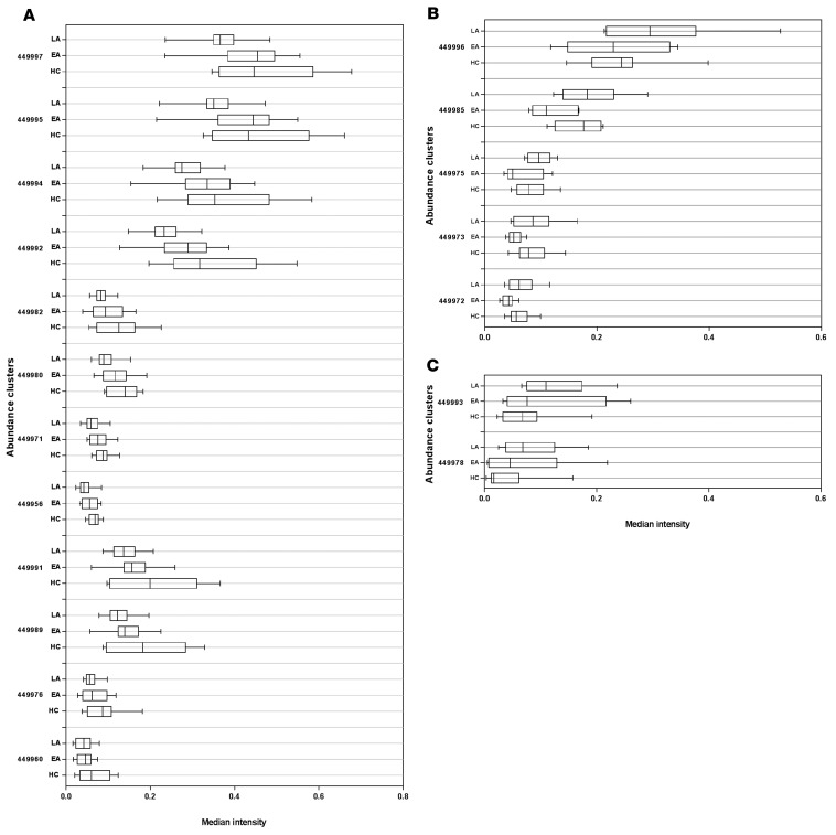
Figure 2. Citrus clusters showing a significantly different abundance in HCs compared with EA and LA HIV-1–infected patients.
(A) CD4+ T cell clusters with higher abundance in HCs (n = 10) compared with EA (n = 10) and LA (n = 10) patients (HCs>EA>LA). (B) CD4+ T cell clusters with higher abundance in LA patients compared with HCs and EA (LA>HCs>EA). (C) CD4+ T cell clusters with higher abundance in LA patients compared with EA patients and HCs (LA>EA>HCs). The box-and-whisker plots depict the minimum and maximum values (whiskers), the upper and lower quartiles, and the median. The length of the box represents the interquartile range. Median intensity is shown on a logarithmic scale.

