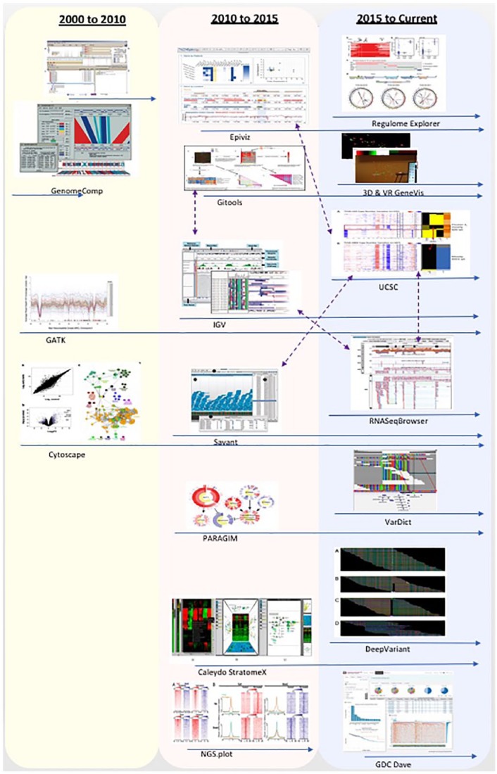
Figure 9.
Timeline and integration of tools; the blue arrows stand for timeline and the purple arrows stand for integration. Between 2000 and 2015, most genomic data visualisation tools only used some traditional methods such as scatter plots, heatmaps, genomic coordinates, networks, and clustering. From 2016, new visualisation methods started to be used such as machine-learning algorithms for predictions and personalised medicine.

