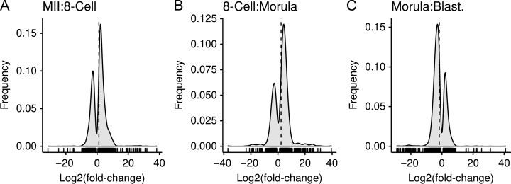
Figure 4.
Frequency distribution of the log2(fold-change) for the differentially expressed genes between the two consecutive stages. These graphs illustrate that the increasing and decreasing in expression distributions over time. The x-axis plots the log2(fold-change) and the frequency on the y-axis. A vertical dashed line denotes the mean log2(fold-change). Short vertical lines between the x-axis and the frequency curve denote individual data points. There was a marked number of genes with an increase in expression for the MII to 8-cell and 8-cell to morula transitions, while the morula to blastocyst had majority decreases.

