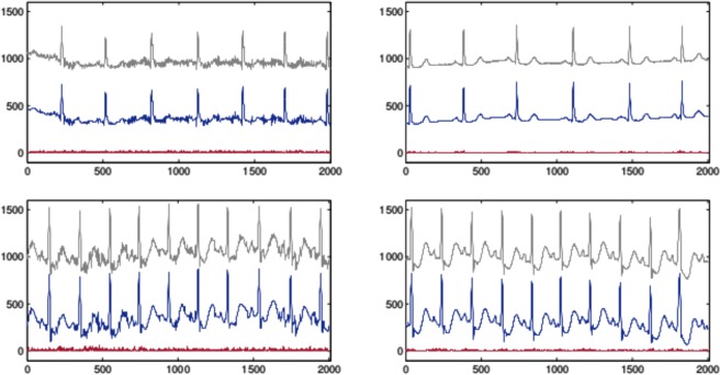
Figure 3.
The upper waveforms in all the graphs are the raw data. The lower waveforms are the corresponding approximations which have been shifted down for visual convenience. The bottom lines represent the absolute value of the difference between the raw data and the approximation. The top left graph corresponds to segment 25 in record 101 and the right one corresponds to segment 120 in the same record. The bottom graphs have the same description as the top graphs but for record 213 and segment 175 (left) and 51 (right).

