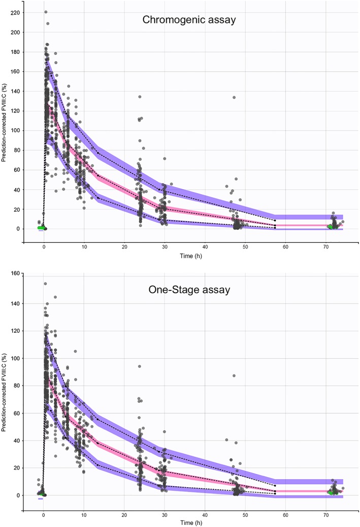
Figure 2.

Prediction‐corrected visual predictive check. The black dash curve represents the 5, 50 and 95 empirical observed percentiles. The purple and pink shaded envelope represents the prediction interval for the simulations of 5, 50 and 95 percentiles. The grey dots represent the observed FVIII activities. The green dots represent the observed data below the lower limit of quantification
