
Figure 2.
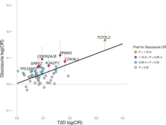
Reported T2D variants and the risk of glucosuria. Scatter plot showing 54 previously reported lead T2D SNPs at established T2D loci that, in a study by the DIAGRAM Consortium (2014) (11), associate with T2D in a subset of Europeans with P < 0.05. The x-axis shows their effect on T2D in the DIAGRAM (2012) data (12), excluding Icelanders (Ncases = 10 706; Ncontrols = 33 668), and the y-axis shows their effect on glucosuria risk (mild, moderate and severe cases (+ and greater) versus negative controls) in the Icelandic dataset (Ncases = 10 857; Ncontrols = 135 512). The black solid line (y = 0.003 + 0.38×) represents results from a simple linear regression using MAF(1-MAF) as weights with R2 = 0.36 (P = 1.6E-6; two-sided t-test). The colors of the circles represent their P-values for the glucosuria OR in the Icelandic dataset. Orange dots represent variants that associate with glucosuria with P < 1.1E-9, pink dots represent variants that associate with glucosuria with 1.1E-9 < P < 9.2E-4, cyan dots represent variants that associate with glucosuria with 9.2E-4 < P < 0.05 and gray dots represent variants that associate with glucosuria with P > 0.05. 95% confidence intervals for the glucosuria OR are shown for variants that associate with glucosuria risk in the Icelandic dataset with P < 9.2E-4 (0.05/54) and are depicted as gray vertical lines. Our data indicate that the effect on glucosuria is proportional to effect on T2D, as expected.