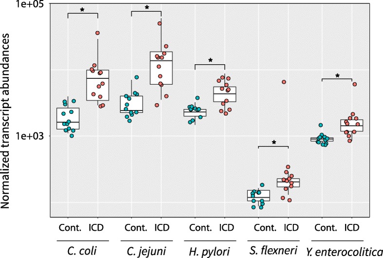
Fig. 5.

Normalized transcript abundance levels associated with known pathogens in control and ICD samples. Boxplots summarize the distributions of transcript abundances for each pathogen in each control (blue) or ICD (red) samples with individual samples denoted by dots. Stars indicate statistical significance of differences between control and ICD samples (padj ≤ 0.05). Normalized transcript abundances are shown on a log scale
