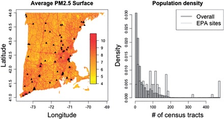
Fig. 1.

The left-hand panel shows the average predicted PM2.5 surface in New England for the year 2003, with the black points representing the location of the EPA AQS monitoring system. The right-hand panel shows a histogram of the number of census tracts within 0.3° of each grid point in New England, along with the histogram of the number of census tracts within 0.3° degrees of the EPA monitoring sites.
