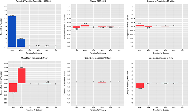
Figure 3: Predicted Probabilities of Transition from Low Diversity White Tracts.

The top left chart (blue bars) shows the predicted transition probabilities from Low Diversity White Tracts between 1990 and 2000 at mean values of the metro level variables. The other five charts (red bars) show predicted changes in these probabilities. These predicted probabilities and changes in probabilities are calculated using significant coefficients (p ≤ 0.05) in column 1 of Table 5. See table 1 for translation of the category abbreviations on the X axis.
