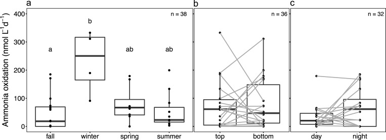
Fig 3.
Box and dot plots of ammonia oxidation (AO) rates according to (a) the season and (b) the depths and (c) the diel sampling time. In b and c, grey lines between groups represent paired sampled. Medians are denoted by central lines and are bounded by the 25th and 75th percentiles. Whiskers show 10th and 90th percentiles. Dots outside boxes and whiskers are outliers. Different letters represent significant difference at level p = 0.05 among groups based on non-parametric pairwise Dunn’s test.

