Figure 4. Preferential sharing of alleles near immunity genes.
(A) Enrichment of tsCgCrSNPs and non-synonymous tsCgCrSNPs for genes associated with significant GO terms (means, blue; medians, red). Each point represents values calculated for an individual gene. For example, in the upper subplot each point is the number of tsSNPs identified in a gene divided by the total number of SNPs identified for a gene. GO terms with a significantly increased ratio of nonsynonymous changes are highlighted with a yellow box. (B) tsCgCrSNP frequency as a function of distance to the closest NLR cluster. (C) Pairwise genetic diversity at neutral (four-fold degenerate) sites as a function of distance to the closest NLR cluster. For (B–C) the thick black lines are mean values calculated in 500 bp windows as a function of distance from a NLR gene. The thin black lines are mean values from 100 random gene sets of equivalent size. The grey polygons are the range of values across all 100 random gene sets. (D) Chromosomal locations of Bal regions with the strongest evidence for balancing selection. Immunity genes with known function in A. thaliana in each region indicated. (E) Values for Watterson’s estimator (Θw) of diversity in Bal regions, calculated from 20 kb windows. (F) Tajima’s D. Dots in (E, F) are a random sample of 1000 windows for non candidate windows. Boxplots report the median 1st and 3rd quantiles of all windows in each class. (G) An example of the site level (dots) and windowed (green) decrease in Fst at the first region on chromosome 2. The subregion without data near 1 Mb is a CC-NLR cluster, which was largely masked for variant calling.
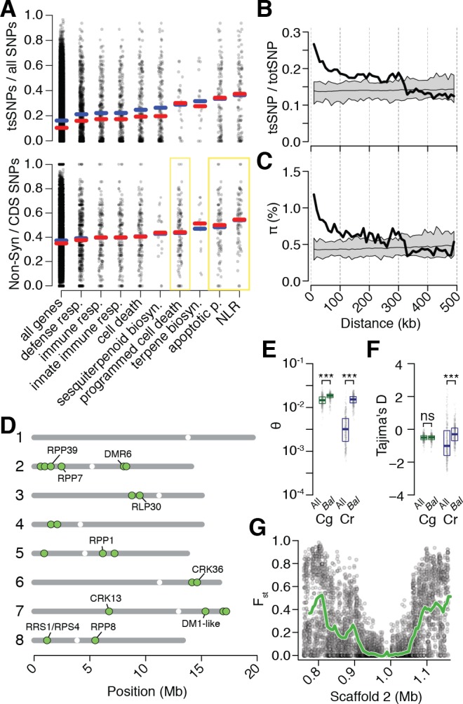
Figure 4—figure supplement 1. Quality metrics for ssSNPs and tsSNPs in C. rubella.

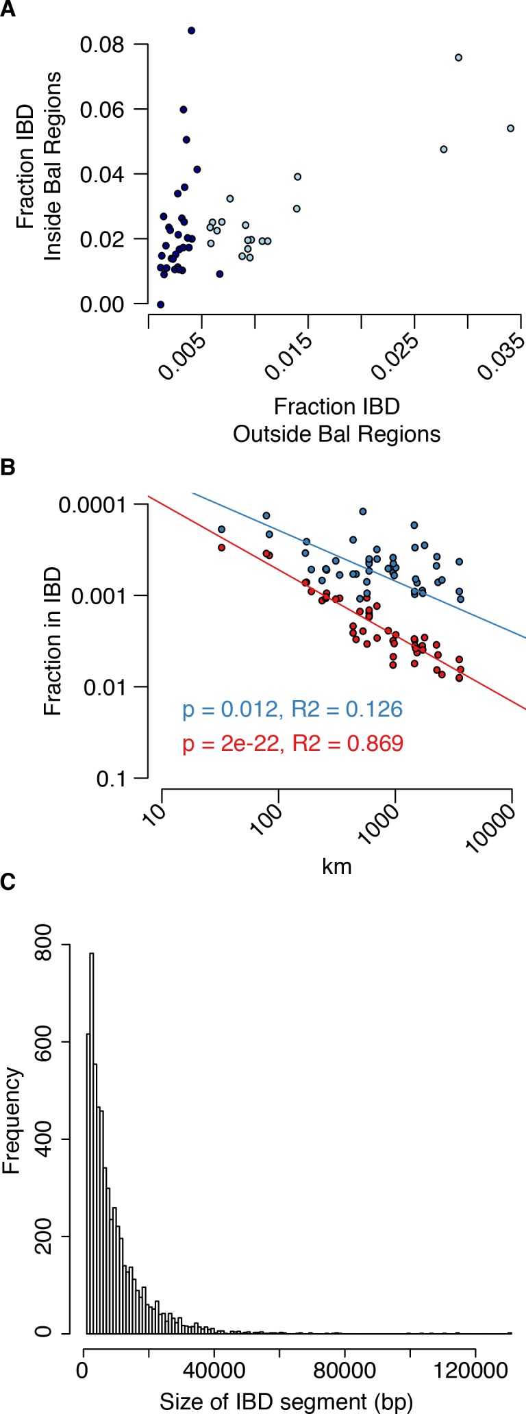
Figure 4—figure supplement 2. Analysis of IBS in balanced regions and genome-wide.