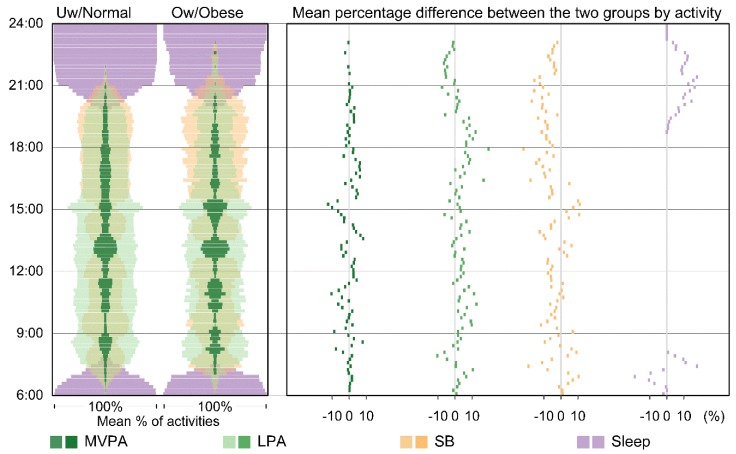
Figure 4.
Time–Activity diagram showing aggregated time-use patterns of activities for the two weight status groups in the least deprived areas. The vertical dimension of the visualisation shows time of day from 6:00 at the bottom to midnight at the top. Activities are aggregated at 10-min intervals. The percentages of time in each interval are summed to 100 percent. The left panel shows the aggregated mean percentage of time spent on the different activities for the two groups. The mean percentage of time is presented as a proportional bandwidth. The right panel shows percentage differences between the two groups for each activity type. The percentage difference was calculated by subtracting the mean percentage of time for the overweight or obese group from that of the underweight or normal group (i.e., the underweight or normal group was the reference). Any results that appear on the right-hand side of the zero axis (positive values) indicate that the percentage of time spent on that activity was greater among underweight or normal children. Colours represent the four activity types: MVPA (dark green), LPA (light green), SB (orange), and sleep (purple). The colours in the left panel are semi-transparent in order to facilitate comparison of different compositional activity patterns both within each weight status group and between the two weight status groups.

