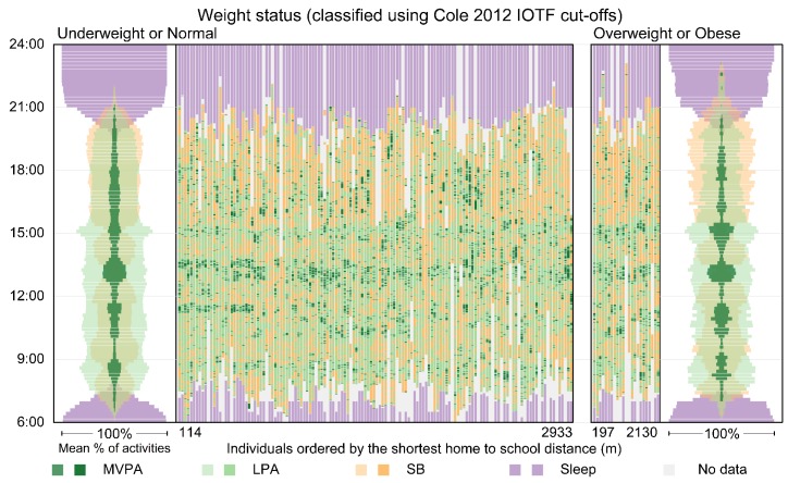
Figure 5.
Time–Activity diagram showing individual and aggregated patterns using data for Wednesdays and/or Thursdays for boys in the least deprived areas who actively travelled to school. The diagram is configured as 2 main panels with boys who were classified as underweight or normal on the left and boys who were classified as overweight or obese on the right. The vertical dimension shows time of day. Individual-level time-use patterns for the 4 activity types for the two groups are shown in the middle of the diagram. Each vertical timeline represents one boy’s sequential daily activities from 6:00 to midnight, with the light grey colour indicating missing information. The boys’ timelines are ordered within each panel by travel distance from home to school in meters. Note that an active travel classification indicates the regular travel mode. It does not guarantee that the child actually travelled to school actively on the two days displayed here. Travel distances greater than 3000 m were removed.

