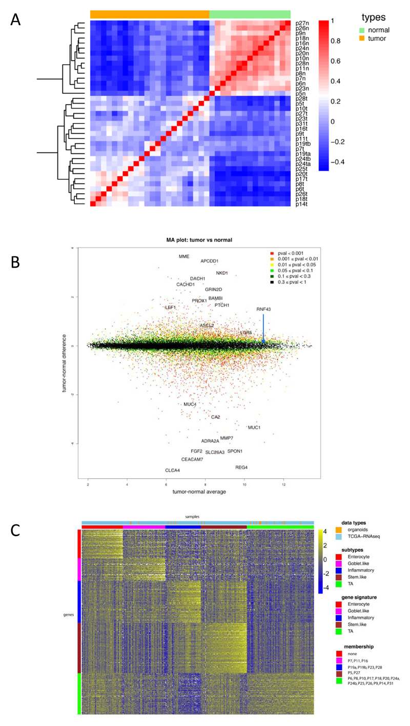
Figure 4. RNA expression analysis.
A) Correlation heat map of normal organoids versus tumor organoids based on 2186 genes (the top 10% of genes in terms of standard deviation). The normal organoids are very highly correlated with each other, whereas the tumor samples exhibit more heterogeneity. The colors represent pairwise Pearson correlations after the expression values have been logged and mean-centered for every gene. The hierarchical clustering is based on one minus correlation distance. The affix N = normal, T = tumor.
B) MA plot of logged normal versus tumor gene expression. P-values are computed with the R package limma, by comparing normal versus tumor gene expression. Cancer associated genes, e.g. APCDD1, PROX1 and PTCH1 are shown in the top half.
C) CRC molecular subtypes are represented by the organoid panel. Genes by samples heat map of normalized gene expression of 22 organoid samples and 431 TCGA RNA-seq tumor tissue samples, organized by subtype. Within each subtype, samples are sorted by their mean gene expression for the signature genes associated with that specific subtype.

