
Figure 2:
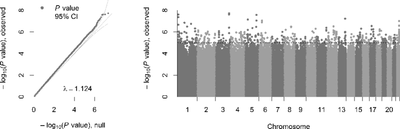
Left. Quantile-Quantile plot of the MWAS in blood. The observed P values, on a –log10 scale, are plotted against their expected values (grey main diagonal line) under the null hypothesis assuming none of the CpGs have an effect. Yellow lines indicate the 95% confidence intervals (CI). The deviation of P values from the main diagonal indicates that there are potentially many markers associated with MDD. The lambda (λ) is close to one, indicating that markers that are not associated behave as expected under the null hypothesis. Right. Manhattan plot of the MWAS in blood. The plot shows the MWAS P values on a –log10 scale (y-axis) by their chromosomal location (x-axis). The dashed line marks the threshold for suggestive significance (P = 1×10⁻⁵).