Figure 1.
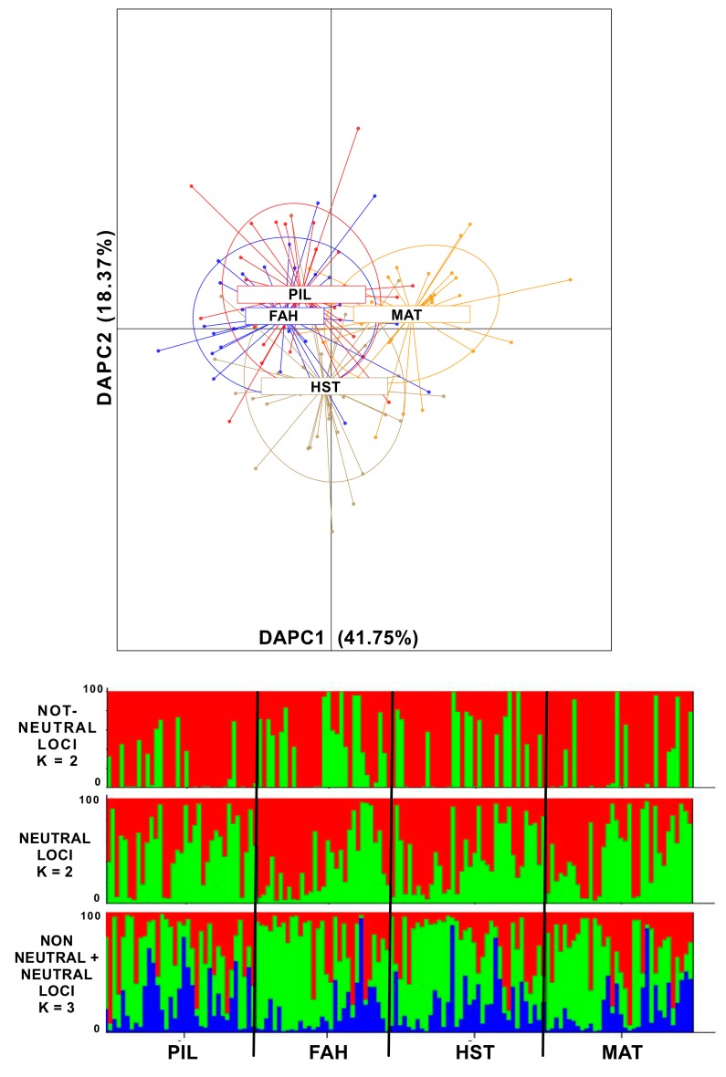
Figure 1 (above) DAPC (Discriminant Analysis of Principal Components) plot of individuals from the four sampling sites along the two most significant axes (PC1 41.75%, PC2 18.37% explained variance). In red are the individuals from Pilgrim Avenue (PIL) and, in blue, are the individuals from Fairhaven (FAH). Both PIL and FAH are located in the inner New Bedford Harbor (NBH) close to the pollution source. Depicted in light brown are individuals from Hacker Street (HST) and, in yellow, are individuals from Mattapoisett (MAT). Both these latter sampling sites are located in the outer NBH area and are exposed to lower pollution concentrations. The insert explains the percent of variance for the first three discrimination eigenvalues (in dark grey are the significant DAs). Figure 1 (below), STRUCTURE plots of the most likely K tested from the simulations with non-neutral (K = 2), only neutral (K = 2), and the complete set of markers analyzed (K = 3).

