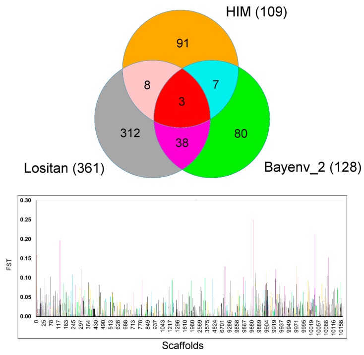
Figure 3.
Venn diagram of the outlier loci interpolation among four candidate outlier detection tests and FST value distribution of each outlier locus along the scaffolds position. In the Venn diagram (above), the numbers encased represent the number of shared SNPs between and among the corresponding set of methodologies. The colors in the Venn diagram reflect the pattern of color used in the Manhattan plot (below) that represents the scaffold position of each outlier locus and its estimated FST value.

