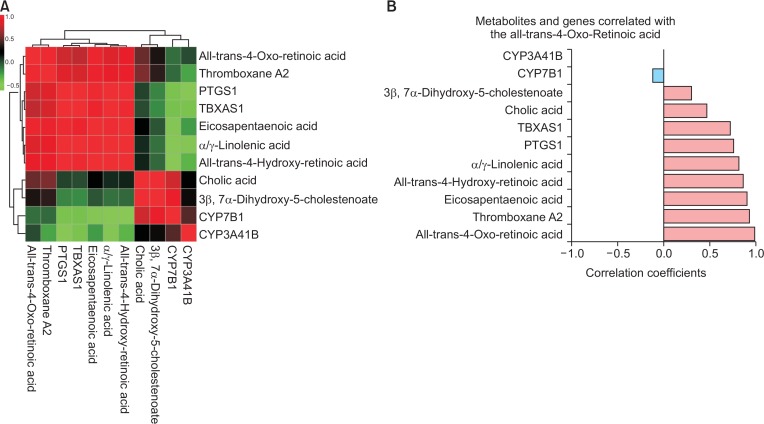
Fig. 11.
Correlation analysis of all metabolites and genes from selected pathways. (A) This figure represents clustered heatmap of correlation with selected metabolites and genes. The red colored metabolites and genes were positively correlated, while negatively correlated metabolites and genes are shown as green colored. (B) Correlation coefficients of each metabolite and gene against all-trans-4-oxo-retinoic acid were shown as horizontal bars. The light blue bar represents negative correlation and the light red bar represents positively correlated metabolites or genes.

