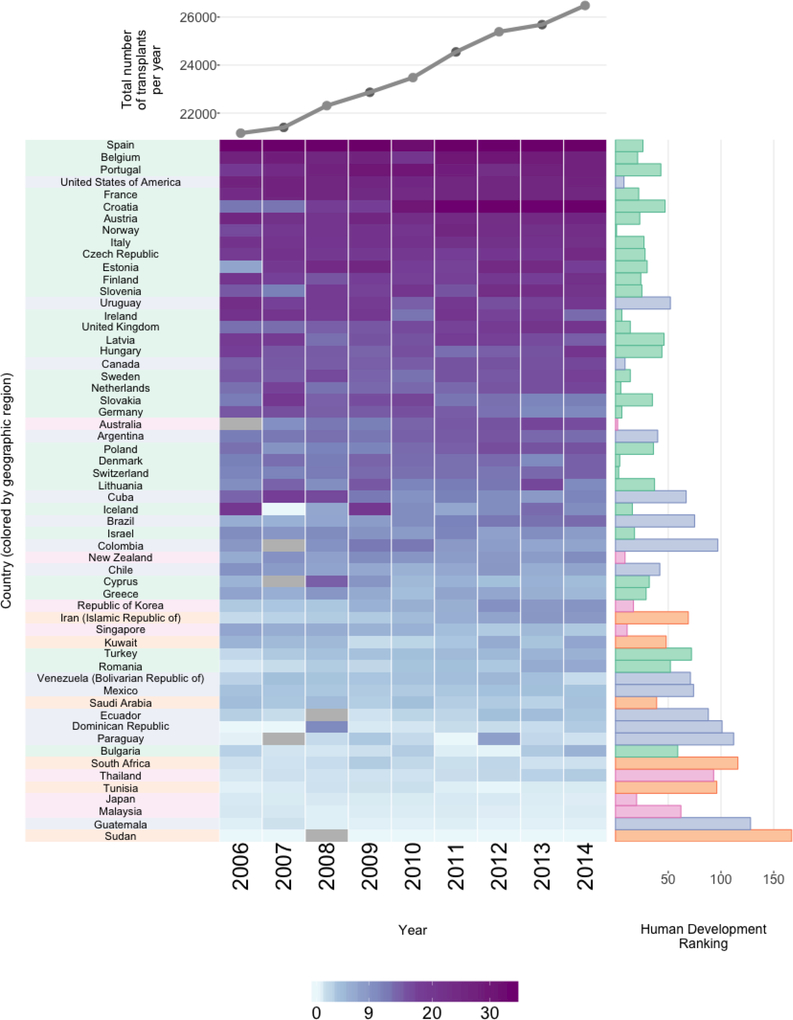
Figure 5:
Organ donations and HDI by country. The right-hand bar plot displays the HDI ranking (lower is better). Each heatmap cell shows the number of organ donations from deceased donors per 100K. Grey cells correspond to missing values. The rows (countries) are ordered by average transplants per 100K. The country labels and HDI bar plot are colored based on region: Europe (green), Eastern Mediterranean (purple), Western Pacific (yellow), America (orange), South East Asia (pink) and Africa (light green). The upper line plot shows total organs donated per year.

