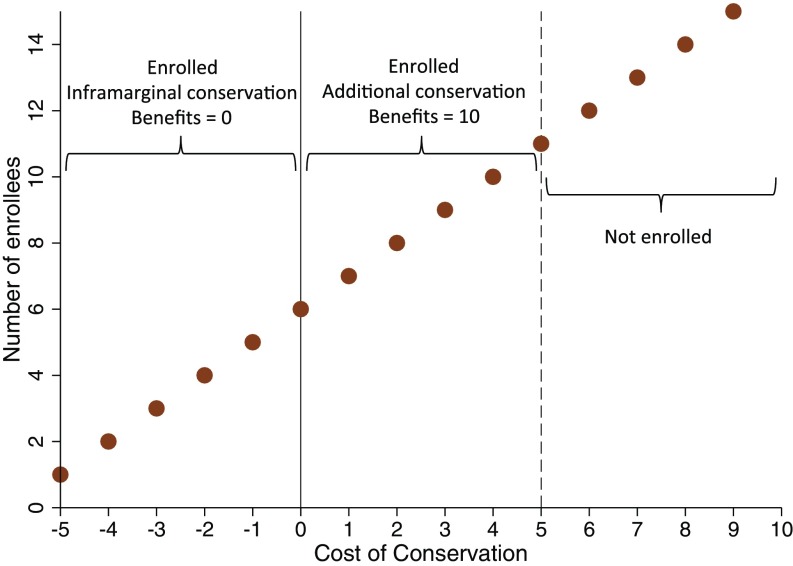
Fig. 1.
Aggregate supply of PES contracts. Aggregate supply curve shows the number of enrollees for contract payments (vertical height of points) against the cost of conservation shown on the horizontal axis. The vertical line at zero separates nonadditional conservation, which generates a per-enrollee benefit of 0, from additional conservation, which generates a per-enrollee benefit that we set to 10 in our illustrative example. The dashed vertical line at 5 marks a hypothetical payment level; supply at this price is 10 landholders, namely the 10 landholders to the left, whose conservation cost is less than or equal to the payment level.

