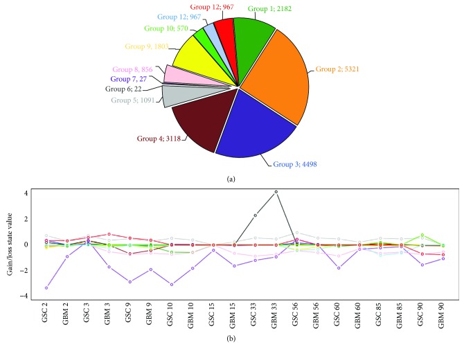
Figure 4.
K-means results to cluster similar genetic CNA profiles in our GBM and GSC samples in 12 groups. (a) Pie chart reporting the number of genes gathered in each cluster according to K-means algorithm. (b) Centroid profiles for each cluster. Each line depicts the intracluster CNA mean values among samples (x-axis). Grey line represents the cluster 5 profile, containing genes amplified in all patients except GBM 90. Purple and pink lines are referred to clusters 7 and 8, containing genes deleted in all samples except for GSC 3 and GSC 56.

