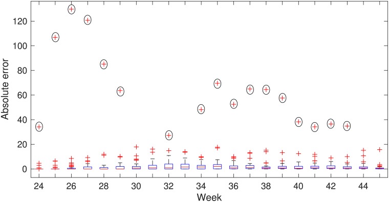
Fig 5. Absolute errors of the simulated human cases of 49 states by weeks with the observed data for the year 2015.
Mean of 1000 realizations has used as the simulated data. On the blue boxes, the red horizontal lines show the median and the bottom and top edges of the boxes indicate 25th and 75th percentile respectively. The whiskers show the ranges of data points not considered outliers and outliers are showing by red + symbol. Californian outliers are marked by black circles.

