
Figure 4.
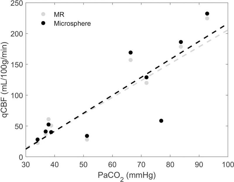
Correlation plot of hemispheric averages of MR-qCBF (in gray) and microsphere-qCBF (in black) versus arterial PaCO2. As expected, perfusion is increased with PaCO2. Dashed lines are calculated by linear regression analysis.
Official websites use .gov
A
.gov website belongs to an official
government organization in the United States.
Secure .gov websites use HTTPS
A lock (
) or https:// means you've safely
connected to the .gov website. Share sensitive
information only on official, secure websites.
Correlation plot of hemispheric averages of MR-qCBF (in gray) and microsphere-qCBF (in black) versus arterial PaCO2. As expected, perfusion is increased with PaCO2. Dashed lines are calculated by linear regression analysis.