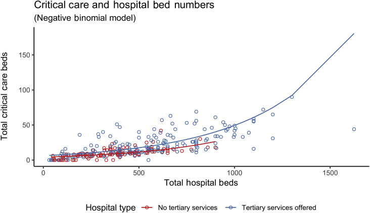
Fig 1.
Scatter plot of critical care beds vs. hospital size, with hospitals coloured by tertiary status. A line of best fit as estimated using a negative binomial regression model illustrates the higher number of critical care beds in hospitals offering tertiary services, compared to hospitals not offering tertiary services.

