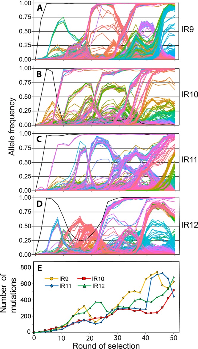
FIG 8.

Mutations in evolving populations. (A to D) Allele frequencies as a function of selection round. (A to D) IR9, IR10, IR11, and IR12 populations, respectively. Whole populations at each even round of selection were deep sequenced by the Joint Genome Institute (JGI) as described in Materials and Methods. Every mutation that reached at least 2% frequency at some point in a single population is depicted as a single line. The sole black line in each graph represents the loss of the e14 prophage. Mutations that reach a frequency of “1.00” are fixed, and subsequent mutations occur within that genetic background. The y axis represents the allele frequency of each single mutation within the population (i.e., a mutation at 0.5 is in 50% of the isolates in the population). The x axis represents the round of selection. Allele frequency data were generated from every even cycle of selection. Graphs were generated using the R library “ggplot2.” Line colors are utilized primarily to allow ready distinctions between subpopulations and otherwise have no significance. Data used to generate these plots are contained within Data Sets S1 through S4. (E) Number of mutations over rounds of selection in evolving populations. Each data point represents the total number of detected mutations at or above 2% frequency in each sequenced whole population. The number of mutations generally increases, but experiences dips as major subpopulations are driven to extinction. Data used to generate this plot are contained within Data Sets S1 through S4.
