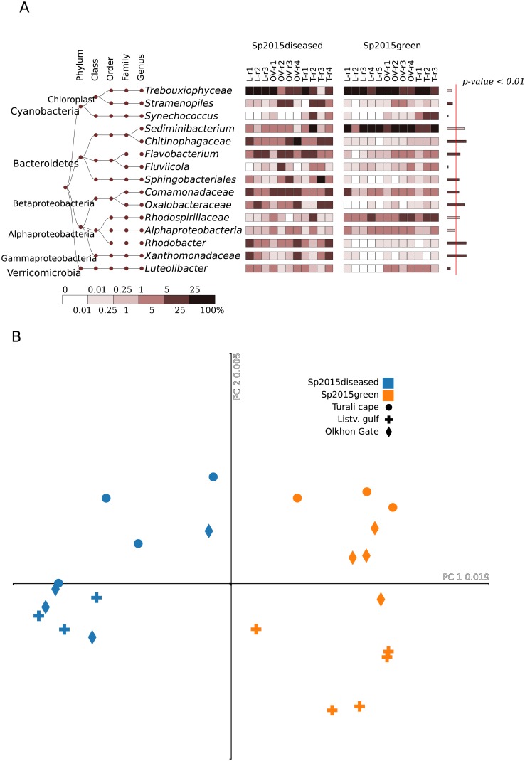
Fig 4. A comparative presentation of the 2015 samples.
Result given for (A) heatmap of the 15 most abundant bacterial groups, at the genus level. The right column on the right shows a significant difference between the healthy and diseased samples, estimated using Mann-Whitney test; width of the bars corresponds to–ln (p-value). Red line separates the significance level of 0.99 (p-value < 0.01). (B) Correspondence analysis at the OTU level based on the unweighted UniFrac measure as a distance.

