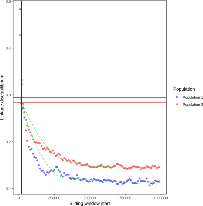
Fig 2. Linkage disequilibrium decay in the two defined Sclerotinia sclerotiorum populations.
Mean linkage disequilibrium (x axis) is plotted for 10 Kb sliding windows up to 1000 Kb from each SNP. The green dashed lines are LOESS curves fit to the mean linkage disequilibrium values. Points are in blue for population 1 (North American and European isolates) and red for population 2 (Australian isolates and a single Moroccan isolate). The vertical lines indicate the position at which linkage disequilibrium decayed to half its maximum value in each population, with population 1 in blue and population 2 in red (red and blue fall together at the same window start, so the red line is not visible). The horizontal lines represent half the maximum linkage disequilibrium for each population, with population 1 in blue and population 2 in red.

