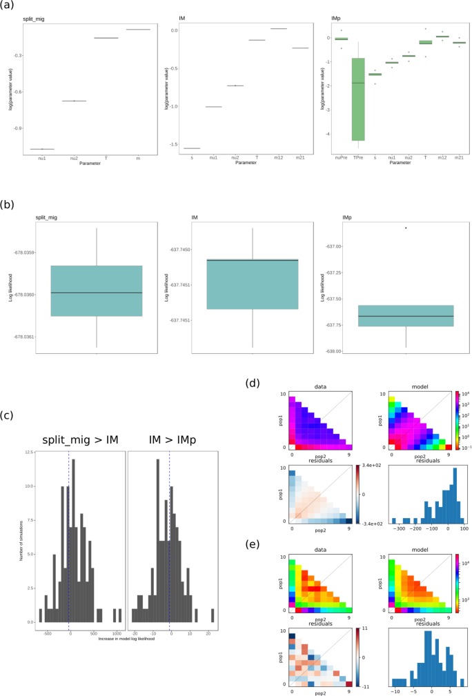
Fig 4. Model fits to sfs data from the Sclerotinia sclerotiorum populations.
(a) Results of parameter optimisations for the three best fitting models, split migration (“split_mig”, corresponding to Fig 3E, log likelihood = -678.04), isolation migration (“IM”, corresponding to Fig 3G, log likelihood = -637.74), isolation migration with an ancestral population size change (“IMp”, corresponding to Fig 3F, log likelihood = -636.64). Model parameters are indicated on the x axis and the interquartile range of the logarithms of optimised parameters for five out of 20 optimisations (from random starting parameters) with the highest log likelihoods are shown on the y axis as boxes and whiskers. The black horizontal bars represent median values. Most parameters converged for most models at higher log likelihoods. Parameters were least convergent for the IMp model, especially for the estimation of ancestral population size change. (b) Interquartile range of model log likelihoods plotted as boxes and whiskers on the y axis for the 5 best fitting models after randomisation and re-optimisation of parameters 20 times. Black horizontal bars represent median values. (c) Results of 10,000 coalescent simulations with the best fitting models. Left panel: with each simulation, the split_mig coalescent frequency spectrum was fit to the split_mig diffusion approximated frequency spectrum and the IM diffusion approximated frequency spectrum. The difference between these two log likelihoods was calculated. The bars represent distribution of differences in log likelihoods (x axis) for each randomisation and the blue vertical dashed line represents the actual difference in log likelihood for the split_mig model and IM model. Since this line falls within the middle of the distribution, the IM model was likely fitting noise rather than additional signal in the data. Right panel: the same as for the left panel but testing the improvement in fit of the IM to IMp models. Again, improvement in log likelihood of IMp over IM was likely due to fitting of noise rather than additional signal in the data. (d) Residual plot of standard neutral model compared with the Sclerotinia sclerotiorum two population joint frequency spectrum. Upper panel: on the x axis is minor allele count for population 1 (pop1) and on the y axis is minor allele count for population 2 (pop2). Colouring represents the scaled frequency of the two population allele counts. The data are on the left and the standard neutral model is on the right. Lower panel: Poisson residual deviation of observed frequency spectra from model frequency spectra. The left is the same as the plots shown in the upper panels but instead of the frequency spectrum, it shows poisson residuals for each point in the frequency spectrum. The right is a histogram of residuals, with residual value on the x axis and frequency on the y axis. (e) The same as for (d) but for the split_mig model. This model was chosen as it was clearly a better fit than the standard neutral model and models with more parameters, i.e. IM and IMp, had only marginally improved fit by fitting noise (as evaluated in (c)).

