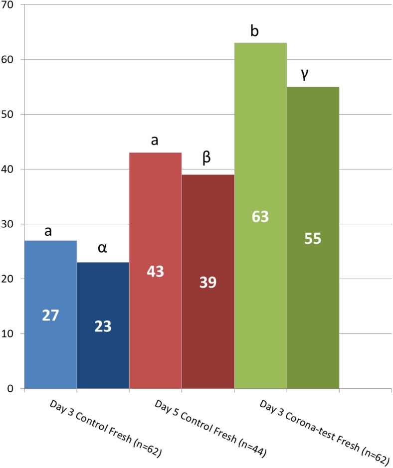
Fig. 2.
Clinical pregnancy and live birth after fresh transfer. Graph depicting the clinical pregnancy (light color), and live birth rates (dark color) obtained in the 3 groups after fresh transfer: day 3 transfer based on embryo morphology and the Corona Test (green bars), and control patients with only morphology-based embryo selection for transfer on day 3 (blue bars) and day 5 after pick-up (red bars). Numbers in the bars are the % clinical pregnancies or live birth respectively. Comparisons were performed using the Chi square analysis between the experimental group and the 2 specific control groups and different letters indicate a statistical difference with p < 0.05

