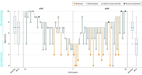
Figure 2. Change in Total Mayo Score for Patients.
The parallel line plot shows change in Mayo score for individual patients. For each participant, a line starts at their baseline total Mayo score and finishes at their week 8 Mayo score. Boxplots of baseline and week 8 Mayo scores per treatment group present the median and interquartile range (25th to 75th percentiles) with whisker length equal to 1.5 interquartile range. aFMT indicates autologous fecal microbiota transplantation; dFMT, donor fecal microbiota transplantation.

