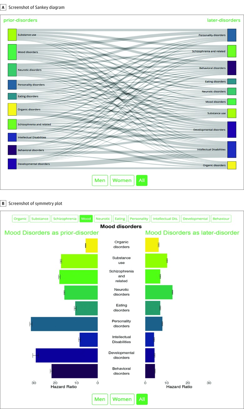
Figure 4. Screenshots of Sankey Diagram and Symmetry Plot Available in the Interactive Data Visualization Website.
A, Sankey diagram that shows the significant associations between all possible pairs of mental disorders. The site allows users to select male and/or female sex, or to show associations with a magnitude of effect larger than a certain threshold. B, Symmetry plot for mood disorders. On the left side, the associations in which mood disorders is the prior disorder are displayed; the bars represent the hazard ratio of receiving a diagnosis of each disorder, depending on whether persons have a previous diagnosis of mood disorders. On the right side, the associations in which mood disorders is the later disorder are displayed; the bars represent the hazard ratio of receiving a diagnosis of mood disorders, depending on whether persons have a previous diagnosis of each other disorder. The site allows users to select the main disorder of interest, male and/or female sex, linear or log scale, or different statistical models depending on potential confounders adjusted for. Dis indicates disabilities.

