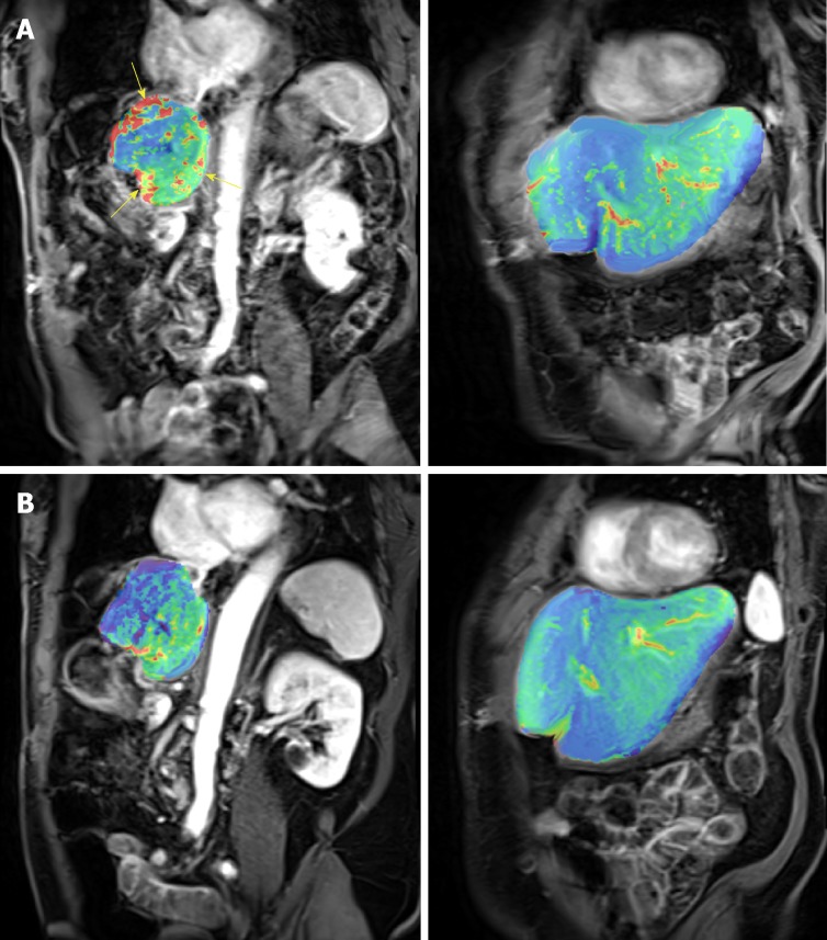
Figure 5.
The effect of RO7070179 in the super responder using heat maps (red means more perfusion and green means less perfusion) between the 2 time periods (baseline 6/20/16 and after 1 cycle 7/28/16). The change of color from red to green correlates with decrease in perfusion between those time periods. A: Pretreatment heat map from pretreatment perfusion magnetic resonance imaging (MRI) (Coronal Section); B: Post treatment heat map from posttreatment perfusion MRI (Coronal Section to include aorta which was used as internal standard for blood flow calibration).

