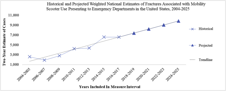
Fig. 2.
This figure extends the regression model from Fig. 1 to the 2024–2025 interval period, to demonstrate that the national estimate of cases would approach 10,000 in said period. The blue crosses represent historical estimates, which are identical to those plotted and described in Table 1 and Fig. 1. The blue, filled triangles represent our projected estimate of cases. The linear regression is demonstrated using the dashed, black colored line. The blue line connecting both historical and projected estimates is meant to illustrate goodness-of-fit with respect to our model.

