
Figure 6. Changes in motor unit discharge rate.
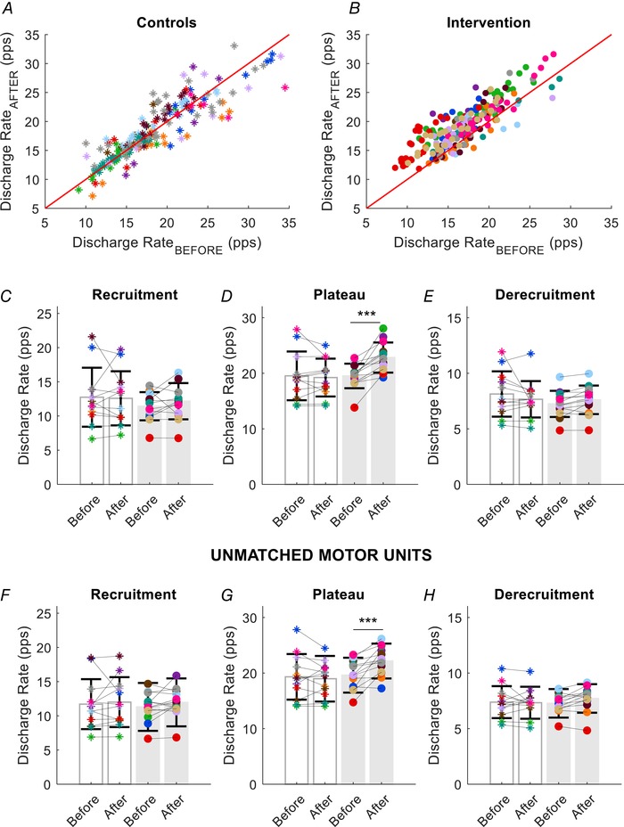
Scatter plots of the discharge rates for the same motor units in each participant in the control (A, asterisks) and strength‐training groups (B, intervention, filled circles). Each subject is indicated by a different colour in all panels. C, average discharge rate at recruitment (first three interspike intervals) for each subject and group (grey bars for the strength‐training group). D, average discharge rate (first nine interspike intervals) during the plateau phase of the trapezoidal contraction. There was a significant increase in discharge rate during the plateau after strength training. E, average discharge rate (last three interspike intervals) at derecruitment for each subject in the control and strength‐training groups. Motor unit discharge rates are shown at recruitment (F), plateau phase (G) and at derecruitment (H) for all the unmatched units. Similar to the matched units, the discharge rate for the strength‐training group increased only during the plateau phase of the ramp contraction. Data are reported as the mean ± SD. *** P < 0.001.