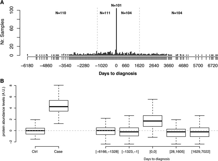
Fig. 1.
Replication of univariate analyses. A, Distribution of days to diagnosis for samples in the replication cohort. The gray dotted vertical lines indicate the cut-offs used in the binned analysis. B, Distribution of normalized protein abundance levels in the cohorts used for PTX3. The top and the bottom of the box represents the 25th and 75th percentile and the band inside the box the median value. The whiskers are calculated as 1.5× the interquartile range. Cohorts ordered as in (A). The dotted gray line indicates the mean of the groups used to determine normalization coefficients, e.g. the control samples from the discovery cohort and the samples from the replication cohort collected at least 3 years before diagnosis (See Methods for details).

