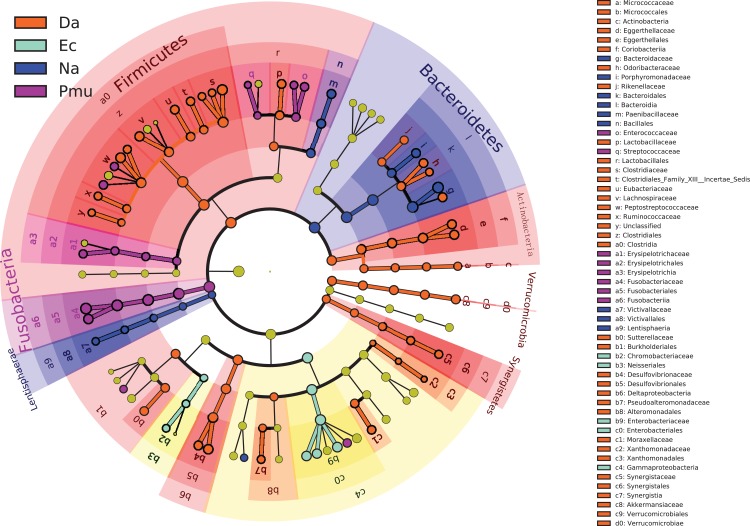
Figure 5. A cladogram showing the differences in relative abundance of taxa at five levels across four snake species.
The plot was generated using the online LEfSe project. The orange, cyan, blue, and purple circles mean that four snake species showed differences in relative abundance, and yellow circles mean non-significant differences.

