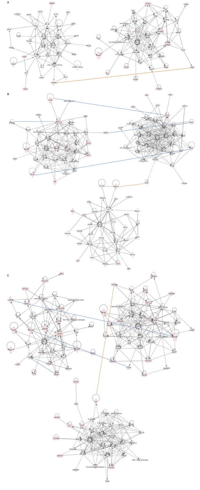
Figure 4. Gene network analysis using IPA program.
A.-C. displayed the top networks from NSCLC, ADE and SQC cohort, respectively. Genes labeled with pink color indicate the input candidate genes from interaction analysis. Arrow lines indicate the potential genetic interactions identified in G x G analysis. Red lines indicate those genetic interactions either achieving the significance level in the joint analysis or having multiple SNP pairs with consistent evidence for genetic interaction across discovery and replication data sets although not achieving significance level in joint analysis; blue line indicate sporadic signals for potential genetic interactions without achieving significance.

