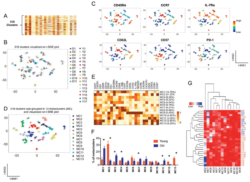
Fig. 3. A combination of PhenoGraph and metaclustering analysis shows CD8+ T cell subsets that altered with aging.
(A-E) The PhenoGraph clustering was performed on CD8+ T cells from 17 young and older adults based on the expression of 24 molecules (Fig 1A), dividing them into 318 subpopulations (A). Subsequently, metaclustering or secondary clustering analysis was done on the 318 subpopulations (D). t-SNE plots showing a landscape of the 318 subpopulations and their relationships to (B) individual subjects, (C) expression levels of the indicated molecules and (D) metaclusters (MC). (E) Heatmap showing the percentages of metaclusters (MC) (Y-axis) and mean expression levels of 24 molecules by individual metaclusters (X-axis). (F) The frequency of different metaclusters (MC) between young and older adults. *q < 0.05 by the t-test with multiple comparison control (false discovery rate, 5%). (G) Heatmap showing the results of an unbiased hierarchical clustering analysis of metaclusters and studied subjects based on the frequency of metaclusters in individual subjects.

