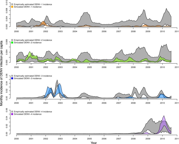
Fig 3. Monthly, serotype-specific incidence of infection per capita, as estimated by Reiner et al. [49] (gray bands) and as reproduced by our calibrated model (colored bands).
Bands show the range of values in which 95% of simulated values lie for a given serotype in a given month. These values were obtained under default parameter assumptions detailed in Table 2.

