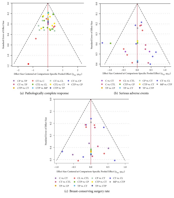
Figure 5.
The comparison-adjusted funnel plot for each outcome. The funnel plot is a scatterplot of the treatment effect size vs its standard error. A funnel plot that is asymmetrical with respect to the line of the summary effect (vertical red line) implies that there are differences between the estimates derived from small and large studies. The studies are ordered from best to worst according to treatment effects. Missing (small) studies lying on the right side of the zero line suggest that small studies tend to exaggerate the effectiveness of higher-ranked treatments compared with lower-ranked treatments. Red line represents the null hypothesis that the study-specific effect sizes do not differ from the respective comparison-specific pooled effect estimates.

