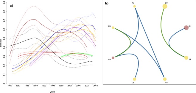
Figure 3.
Panel (a): estimated intensity functions of the key wheat producing regions. Bold lines represent the median of the ensemble, while the dotted lines identify the maximum and the minimum of the ensemble. The different colours are associated with the 8 key regions, as in Fig. 1. Panel (b): summary plot of the analysis on heat stress events. Disks represent the 8 key regions, with the size being proportional to the corresponding wheat production in 2016 (data from FAOSTAT). Yellow disks represent regions with temporal inhibition within the region itself, while red ones represent regions with temporal clustering within the region itself. Blue links represent estimated clustering between regions, while green links represent estimated inhibition between regions.

