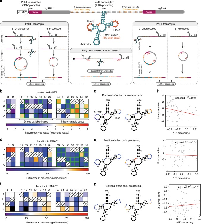
Fig. 2.
Mutagenesis screen identifies sequence determinants of tRNA processing and promoter activities. a Experimental design for a tRNA mutagenesis screen in human cells. Parallel libraries of partially degenerate tRNAPro were created (dark orange = mutated positions), with and without a CMV promoter. Degenerate barcodes (light orange) were placed between the gRNA and tRNA sequences to allow variant identification following processing. A short buffer sequence was included between the barcode and the tRNA to protect the barcode from cleavage. RNA species from (+)CMV libraries were decapped to avoid the 5′cap-mediated inhibition of RNA circularization. b, d, f Heatmaps showing the effects of all single mutations at each nucleotide position on promoter activity (n = 3 paired pDNA/circRNA libraries with no Pol-II promoter) (b), 3′ processing (n = 3 paired pDNA/circRNA libraries with no Pol-II promoter) (d), and 5′ processing (n = 3 paired pDNA/circRNA libraries with CMV promoters) (f) (hatched squares = wild-type nucleotides; black squares = no measurement). In (b) promoter activity was calculated as the ratio of observed reads in the RNA fraction of a given mutation compared to its expected frequency in the library from sequencing the plasmid DNA (green borders = changes from wild type with a probability of 80% or greater, BEST test; only mutations with observations in all three libraries were included in significance testing). In d, f processing efficiency was inferred by averaging the binomial probability distributions (processed of total reads) across replicates then taking the point of highest probability as the final value estimate (green borders = changes from wild type with probability densities overlapping by less than 5%). c, e, g Corresponding tRNA diagrams showing for each modified position, the mutation which rendered the lowest (left) and highest (right) levels of their respective measurements (colors correspond to the heatmaps in (b), (d), (f), respectively). h Correlation plots for all combinations of measurements. Specific nucleotide changes are as indicated. Red lines reflect a linear fit. Source data are provided as a Source Data file

